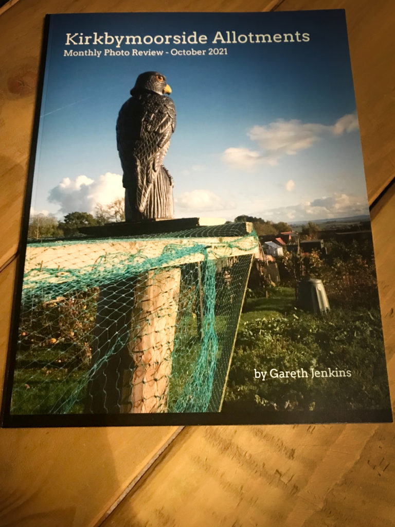
Thanks to the encouraging words of Daniel Milnor I have taken the plunge and had a go at producing a magazine using Blurb and the Bookwright package.
It arrived this week, delayed somewhat in transit, but got here eventually and I’m dead chuffed.

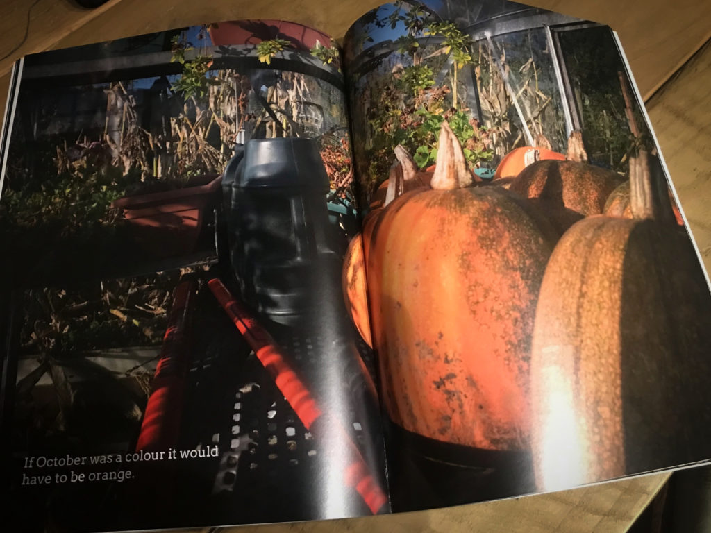
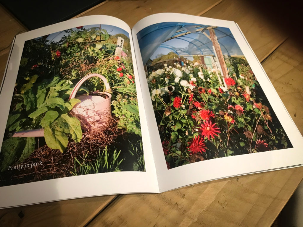
What impressed me most was the quality of the colours and the clarity. All the photos were taken with my Ricoh GR3 on one sunny afternoon up at the allotments and the magazine reflects perfectly the lovely light there was at the time.

As Milnor advises it is good to look at these early forays into self-publishing as experiments and I’ve certainly learnt a lot by creating this first Blurb magazine. My layout was very basic and I now need to look at being more creative with the pigeon club magazine which I’m currently working on. This allotment magazine will be monthly, I’m aiming to capture ‘A Year in the Life of the Allotments’ with a view to there being a display at our AGM next year.
I’ll keep tweaking the design as I learn more so they’ll be different each month – hopefully better each time.
To that end – learning more about layout and typography – I’m delighted to have discovered a fantastic YouTube channel ‘Yes I’m a Designer’ and having only had time to watch three tutorials I’ve already learnt loads which I’m putting into practice immediately with the pigeon magazine. Here’s the first one I watched:
So a steep learning curve but creatively great fun.
